How do we make financial reconciliation more visual?
My Responsibility
Led an engineer and designer to redesign the reconiciliation interface. I was responsible for program management high-fidelity prototyping and user-testing.
Duration
6 weeks
Category
User Experience Design, Interface Design, User Studies
The Impact
A Solution That
Helped Users
And Sales People
120K
In Sales Pipeline
80%
Est. dec in Processing Time
The Problem
Reconciling settlement reports from food delivery marketplaces with bank statements is complex. They needed to reconcile with their banks and the marketplace. The then existing design did not help users understand the 2 reconciliation statuses of each transaction. More importantly, it didn't let see actionable insights. I created a design that made it easier for users to visualise different stages of transaction reconciliation in a comprehensible manner.
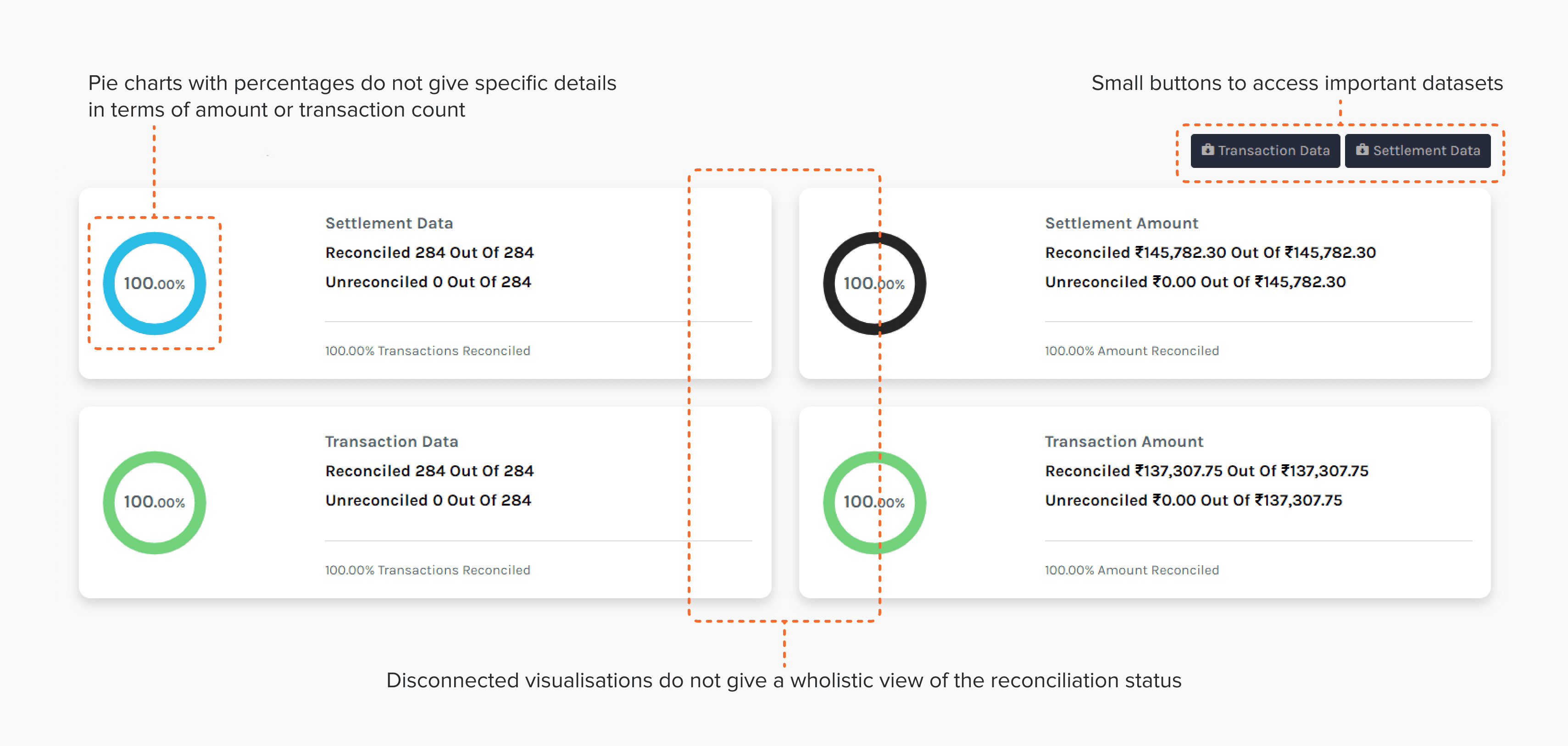
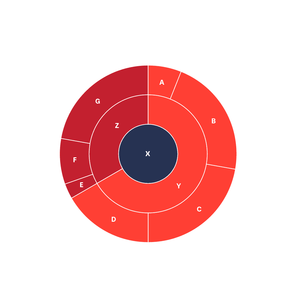
Issues With Existing Design
Lack of specific details
in pie diagrams
Visuals did not show
relationships between
different data sets
Buttons did not let users
complete necessary actions
with ease
Exploratory Research
We Needed to
Learn Business
Needs …
Focus Understanding how accountants and finance managers reconcile transactions and settlements, what tools do they use and what are they looking for in the complete dataset.
Methods - Interviews
We talked to the people who used the previous dashboard, and the development team of the previous dashboard to understand their context. Additionally we also spoke with heads of finance and audit at larger firms to learn about best practices.
Insights
Details were missing At its core, any reconciliation tool needed to clearly highlight potential errors. Currently the visualisation merely showed what % of transactions were not reconciled. It didn't let users see transaction specific details. For this they needed to download an excel file
Confusing nomenclature Accountants weren't familiar with the terms of the visualization module. Partly because the initial development team was not familiar with the right terminology. But, this reconciliation use case was also new and didn't have established terminology.
Alignment with fundamental accounting principles
Traceability Visualizations can help make the flow of transactions or the matching of data between systems transparent.
Verifiability Visual tools help you quickly double-check that things are correct.
Actionability Highlighting anomalies or discrepancies visually or incorporating collaborative features allows users to take corrective action based on what they see.
Completeness Visualizations can help identify gaps by showing missing or incomplete data. This can be particularly useful when reconciling multiple data sources
Sample Questions
How Are You Using
Reconciliation Analytics?
How Are You Using
Reconciliation Analytics?
Secondary Research
Focus In this part which we studied how data visualisation works, how datasets similar to ours are being visualised and how we could do it more efficiently.The research was conducted in two parts:
Methods - Online Research & Current User Interviews
Secondary research: We also did a competitive survey to find if any product that showcases a similar idea through a dashboard.
Primary research: In this part we talked to the people who used the previous dashboard, and the development team of the previous dashboard to understand their context.
Findings
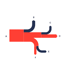
To map this type of data either expandable pie charts or funnel charts or Sankey diagrams can be used. This validated the initial idea of funnel charts since funnel charts are Sankey diagrams for simple, linear flows. We found a good example of funnel charts on Atlassian Marketplace by Kanbananalytics. This became the main reference of the interface for rest of the project.
Image source: https://datavizproject.com/
Visualization Options I considered
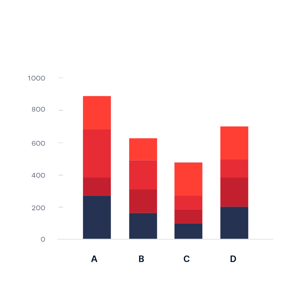
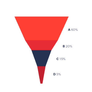
Ideation - Visualization
Paper Prototyping
I created paper explorations of what a sankey chart and expandable pie-charts would look like in situations that needed complex reconcilitation visusalization and tested it among internal users.
Results
Ultimately, we found that Sankey Diagrams' rectangular and vertically expandable shapes made better use of precious horizontal real-estate than pie-charts complex reconciliation scenarios.
Design Reasoning

Ideation - Dashboard
Then we started to brainstorm on what features were needed for the dashboard.
Filters
Timeframe: calendar, to choose specific date or time range
Channel: payment, delivery and e-commerce channels, auto chosen as per the merchant
Methods: applies for payment methods only, will not be there in delivery and e-commerce cases
Sub-methods: applies for payment methods only, will not be there in delivery and e-commerce
Amount-Count switch: A switch to change the mode of data between transaction amount and transaction count
Visualisation: A clickable funnel chart with columns for orders, transactions, settlements and mismatches
Table: A table showing a few entries from the selected dataset, all recent transactions. Also has a download button.

Usability Testing
After a clear enough idea was formed, I started the final layout and prototyping of the dashboard. It went through multiple iterations after reviews from product teams. Once this was done we conducted Usability Testing. Our Questions were aligned with the four principles - Traceability, Verifiability, Actionability & Completeness.
Traceability
Can Users See How
Transactions
Flow stage-to-stage ?
Verifiability
Actionability
Completeness
Usability Insights
After a clear enough idea was formed, I started the final layout and prototyping of the dashboard. It went through multiple iterations after reviews from product teams. Once this was done we conducted Usability Testing. Our Questions were aligned with the four principles - Traceability, Verifiability, Actionability & Completeness.
Traceability
Verifiability
Actionability
Completeness
Key Changes
The key insights that we found from the testing sessions and the proposed solutions for them are mention below.
We could not incorporate the assigning feature. After proposing these changes our project halted and the product development took over.
Clickability of boxes not apparent to users
Solution: Changing the color saturation of the box and increasing text size in the hover state.
Changes in table not apparent to user
Solution: Changing the colour of the table header according and adding intermediate loading animations before updating the table.
Greater transaction level detail required by user. More actionable features needed as well like assigning entries to accountants.
Solution: Display an overlay that shows mismatch details according to internal and external records.
Terminologies used were unfamiliar to all interviewees. These varied across every single interviewee.
Solution: Display a tooltip explaining the term on 'i' icon. Also give an option to edit the terminology.
Senior interviewees needed someway to import this chart to a powerpoint or other ways of presentation.
Solution: Export option current graphic on-screen to transparent .png, .svg, or .jpeg. Share to Email/Slack option.
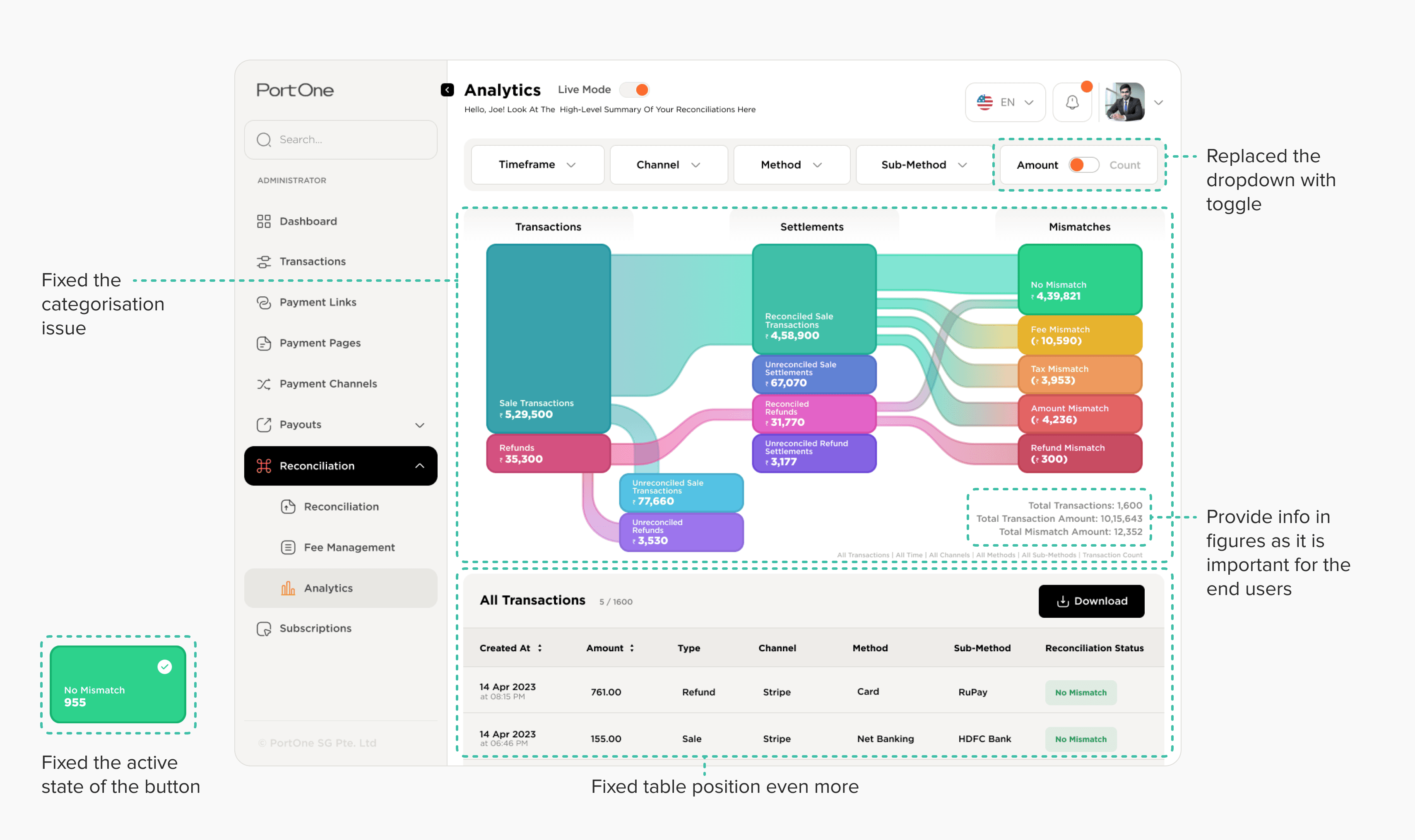
Initial Design
I made the first version which is shown below. It had a few issues like wrong UI elements, bad hierarchy and emphasis using layouts.
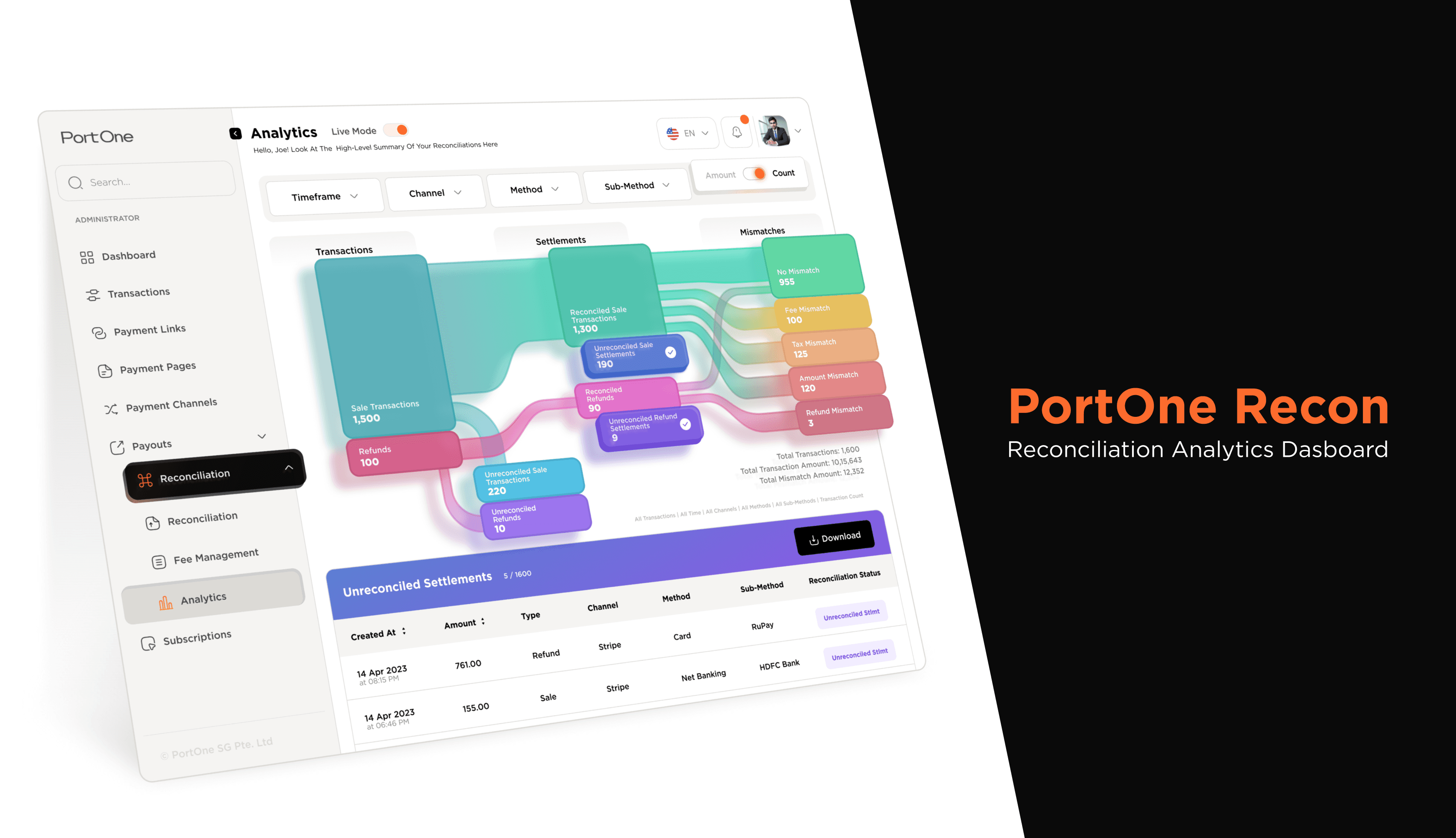
Final Design
The issue with categories of the data and connections between them was fixed in this version. I also added more information in figures as it was important for the end users. Also fixed the issues with other UI elements.